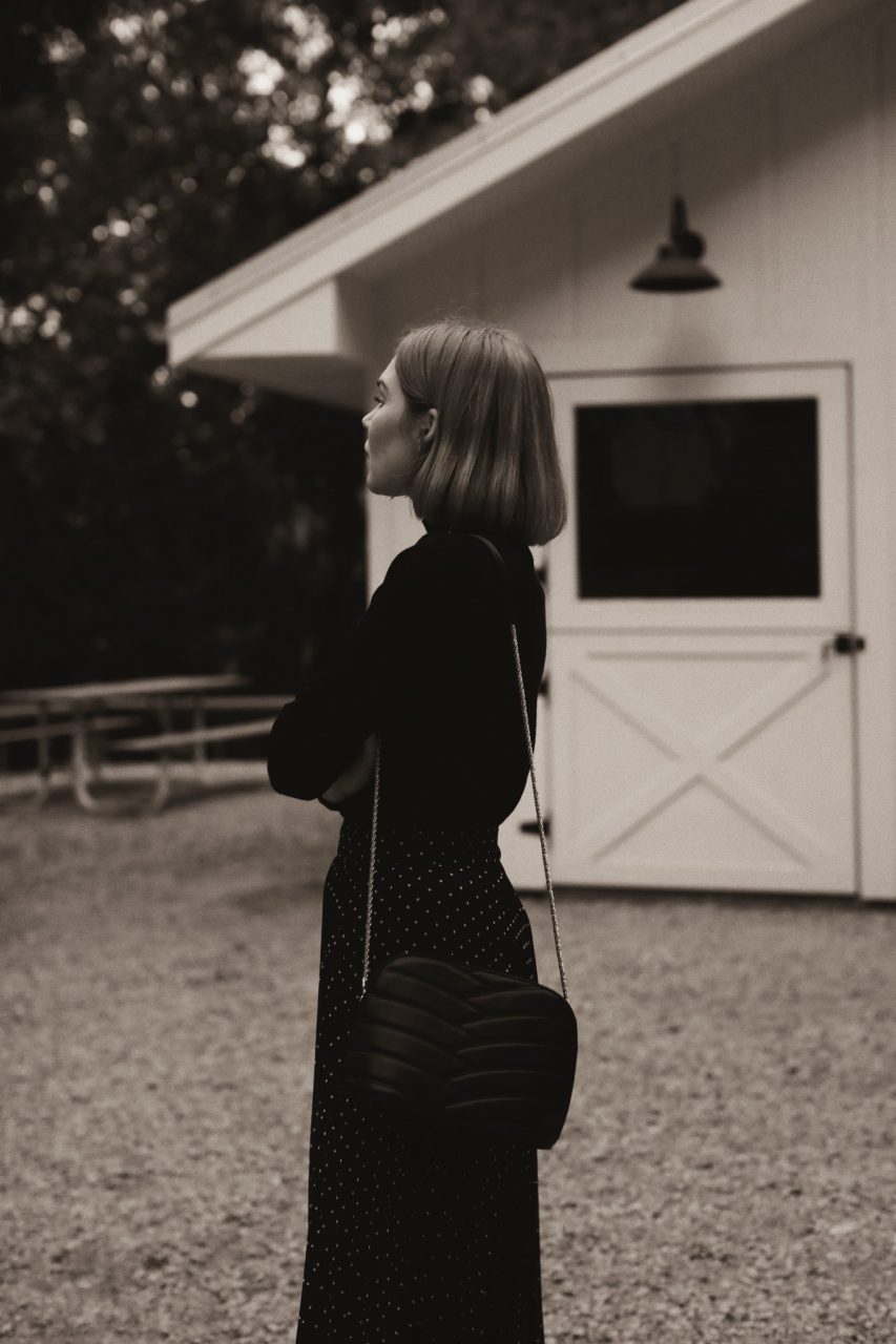
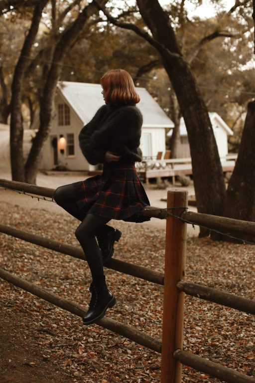
One of the questions I get quite a lot (aside from just how I edit in general) is how I edit my Black and White photos to be a bit warmer.
While I’m not ready to give away all of my editing secrets just yet, I thought it would be only fitting for this time of year (when giving is the spirit of the season) to give my exact formula for how I create my warm-toned Black and White photos. My other edits require a bit more time and programs to get the tones just right, but for a quick B&W, I just use a few apps on my phone. Here’s a step by step with the exact ‘recipe’ I use.
- I start with my color version of the photo. Oftentimes it has already been edited a bit (as my initial intention with most photos is to use color), but for whatever reason, I’ll decide to do a B&W pass to see how it looks. Sometimes it’s because there is a color in the photo that doesn’t match the rest of my feed (I’m especially picky about this) or sometimes it’s because I simply want a B&W photo to sort of ‘break up’ my feed. I find that sprinkling in B&W edits helps the colors on my page to look more cohesive, by reducing the amount of colors you see when looking at the grid overall. Sometimes I just like the idea of a ‘moodier’ photo and B&W always seems to do the trick.
![](https://static.prettylittlefawn.com/wp-content/uploads/2020/12/70CF3D06-866A-483E-B26A-1415ABA945F8-90CAA0E9-27F9-4265-BF4A-238E650DFB1E-2-213x320.jpg 213w,https://static.prettylittlefawn.com/wp-content/uploads/2020/12/70CF3D06-866A-483E-B26A-1415ABA945F8-90CAA0E9-27F9-4265-BF4A-238E650DFB1E-2-853x1280.jpg 853w,https://static.prettylittlefawn.com/wp-content/uploads/2020/12/70CF3D06-866A-483E-B26A-1415ABA945F8-90CAA0E9-27F9-4265-BF4A-238E650DFB1E-2-1024x1536.jpg 1024w,https://static.prettylittlefawn.com/wp-content/uploads/2020/12/70CF3D06-866A-483E-B26A-1415ABA945F8-90CAA0E9-27F9-4265-BF4A-238E650DFB1E-2.jpg 1365w,https://static.prettylittlefawn.com/wp-content/uploads/2020/12/70CF3D06-866A-483E-B26A-1415ABA945F8-90CAA0E9-27F9-4265-BF4A-238E650DFB1E-2-100x150.jpg 100w,https://static.prettylittlefawn.com/wp-content/uploads/2020/12/70CF3D06-866A-483E-B26A-1415ABA945F8-90CAA0E9-27F9-4265-BF4A-238E650DFB1E-2-313x470.jpg 313w,https://static.prettylittlefawn.com/wp-content/uploads/2020/12/70CF3D06-866A-483E-B26A-1415ABA945F8-90CAA0E9-27F9-4265-BF4A-238E650DFB1E-2-512x768.jpg 512w,https://static.prettylittlefawn.com/wp-content/uploads/2020/12/70CF3D06-866A-483E-B26A-1415ABA945F8-90CAA0E9-27F9-4265-BF4A-238E650DFB1E-2-1066x1600.jpg 1066w)
- I’ll open the photo in VSCO and apply a simple B&W filter on the color image. My favorites are B3 B&W Classic and B1 B&W Classic. Then I add some grain (about 2.5-3.5) – on color images I tend to use much less grain, but as I like a film look with B&W, I up that amount for these edits. On top of that, I use a bit of a Vignette (again, a small amount, up to about 3.0), and export the photo out. You’ll notice that the photo looks very neutral, and in my opinion just a bit too cool in tone for my feed. So next I’ll add in some warmth.
![](https://static.prettylittlefawn.com/wp-content/uploads/2020/12/0EED8F34-0C97-47DD-A022-F01C207309E6-F7033057-1BF0-4635-A601-41AB3529244C-213x320.jpg 213w,https://static.prettylittlefawn.com/wp-content/uploads/2020/12/0EED8F34-0C97-47DD-A022-F01C207309E6-F7033057-1BF0-4635-A601-41AB3529244C-853x1280.jpg 853w,https://static.prettylittlefawn.com/wp-content/uploads/2020/12/0EED8F34-0C97-47DD-A022-F01C207309E6-F7033057-1BF0-4635-A601-41AB3529244C-1024x1536.jpg 1024w,https://static.prettylittlefawn.com/wp-content/uploads/2020/12/0EED8F34-0C97-47DD-A022-F01C207309E6-F7033057-1BF0-4635-A601-41AB3529244C.jpg 1365w,https://static.prettylittlefawn.com/wp-content/uploads/2020/12/0EED8F34-0C97-47DD-A022-F01C207309E6-F7033057-1BF0-4635-A601-41AB3529244C-100x150.jpg 100w,https://static.prettylittlefawn.com/wp-content/uploads/2020/12/0EED8F34-0C97-47DD-A022-F01C207309E6-F7033057-1BF0-4635-A601-41AB3529244C-313x470.jpg 313w,https://static.prettylittlefawn.com/wp-content/uploads/2020/12/0EED8F34-0C97-47DD-A022-F01C207309E6-F7033057-1BF0-4635-A601-41AB3529244C-512x768.jpg 512w,https://static.prettylittlefawn.com/wp-content/uploads/2020/12/0EED8F34-0C97-47DD-A022-F01C207309E6-F7033057-1BF0-4635-A601-41AB3529244C-1066x1600.jpg 1066w)
- Next I open the B&W photo in A Color Story. This is my real trick, is that the filter pack I created with them has one filter in particular that I reach for daily, the Suede Filter in the Fawn Pack. I’ve found that applying this particular filter on top of a B&W photo gives the perfect amount of warmth. Here’s the order that I apply : reduce the contrast (-8), apply the Suede Filter (+48), and up the color temperature (+25). And that’s it! That’s how I make my B&W photos feel just a bit warmer without becoming entirely sepia toned.
![](https://static.prettylittlefawn.com/wp-content/uploads/2020/12/ACS_5277-213x320.jpg 213w,https://static.prettylittlefawn.com/wp-content/uploads/2020/12/ACS_5277-853x1280.jpg 853w,https://static.prettylittlefawn.com/wp-content/uploads/2020/12/ACS_5277-1024x1536.jpg 1024w,https://static.prettylittlefawn.com/wp-content/uploads/2020/12/ACS_5277.jpg 1365w,https://static.prettylittlefawn.com/wp-content/uploads/2020/12/ACS_5277-100x150.jpg 100w,https://static.prettylittlefawn.com/wp-content/uploads/2020/12/ACS_5277-313x470.jpg 313w,https://static.prettylittlefawn.com/wp-content/uploads/2020/12/ACS_5277-512x768.jpg 512w,https://static.prettylittlefawn.com/wp-content/uploads/2020/12/ACS_5277-1066x1600.jpg 1066w)
I hope this was helpful, and answered a few questions you may have had. And, if you end up using my ‘recipe’, feel free to use the hashtag #PLFblackandwhite so I can see your edits!
Aura Narita
December 10, 2020
Thank you so much fawn, your feed so aestheticable haha lol, btw hi from indonesia^^